Pre to post-production
Crewing
Casting
Location Scouting
TVC
Social
Online Content
E-Commerce
Set design
Set build
Set dressing
Prop styling
Prop making
Visual Merchandising
Visual identity
Logo design
Graphic assets
Tone of voice
Packaging
Web design development
Maintenance & administration
Platform development
SEO
Content strategy
Creation & media toolkit
Paid social
Email marketing
Growth strategy

The Revelrie
360 PROJECT
For The Revelrie, a Brazilian British fashion label, we led a two-year creative partnership that shaped the brand from the ground up. From creative direction and content creation to visual identity, tone of voice and digital experience, every element was carefully crafted to express a distinct point of view with clarity and intention.
Key Strategies
VISUAL IDENTITY, CONTENT CREATION, CREATIVE DIRECTION, WEB DESIGN

Creative Direction
INTEGRATED STRATEGY
Creative direction for The Revelrie was never just about defining an aesthetic. It was about crafting a brand world with cultural resonance, a visual and conceptual language that feels timeless, purposeful, and aligned with the values of a modern, fashion-conscious audience.
Over the course of two years, we shaped The Revelrie across every layer of its identity. From creative direction and web design to digital experience and tone of voice, the process was both holistic and intentional. The goal was never simply to launch a brand, but to build a foundation for lasting relevance and meaningful connection. Every touchpoint was designed not only to show how the brand looks, but to express how it feels and how it lives in the imagination of its audience.
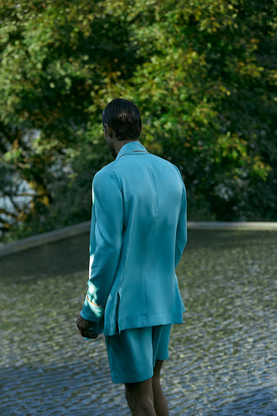
Rather than relying on product-led visuals, we developed a campaign rooted in story and atmosphere. Casting, location, styling, and crew were carefully selected to reflect a refined tropical sensibility, one that feels elevated, effortless, and emotionally engaging. The result is a body of work that is both contemporary and enduring, strategically crafted to hold long-term value. Each frame contributes to a wider narrative that strengthens the brand’s presence and builds equity over time.
Narratives built with cultural relevance and strategic clarity, where every detail reinforces how the brand is seen, felt and remembered.


We create visual identities that are strategically grounded, visually distinctive, and built for lasting recognition.
Visual Identity
BRAND COLLATERAL
Visual identity is not just about how a brand looks. It is about how it makes people feel. It is the visual language that captures a brand’s personality, values, and point of view, and translates them into something tangible and memorable.
For this project, we began by developing a signature brand colour that would serve as a recognisable anchor across every touchpoint. It became the foundation of a visual system that feels both distinctive and timeless.
We created a custom logo and brand symbol designed to communicate clarity, confidence, and refinement. Every detail was carefully considered, from the geometry to the balance of form and space, ensuring the result was both functional and expressive.
But a brand identity comes to life in the details. We extended this visual language into the physical world through branded tags, carrier bags, ribbons, and textured materials. These elements were crafted to feel tactile and immersive, offering a sense of care and quality at every interaction.
Together, these components form a cohesive brand experience that connects emotionally and visually. It is an identity that invites recognition, builds trust, and leaves a lasting impression.

Digital experiences designed to reflect the brand’s essence with clarity and purpose, where every interaction feels intentional, elegant and immersive.
Web Design
INTEGRATED STRATEGY
For The Revelrie, web design was approached as an extension of the brand’s visual identity. It was an opportunity to bring consistency, clarity and precision into the digital space.
The aim was to create a website that felt aligned with the brand’s core values of quality, craftsmanship and refined simplicity. Every element was carefully considered. From the structure and layout to typography, colour and flow, the design reflects the same attention to detail present throughout the brand.
The site was built to be clean and intuitive. Navigation is straightforward, with minimal distractions. Visuals take centre stage, supported by a layout that allows the content to breathe and perform. Nothing feels rushed or forced. The overall experience is calm, structured and intentional.
This digital presence supports the brand’s long-term positioning. It is functional and elegant, offering a clear and cohesive user journey while reinforcing the credibility and character of The Revelrie.


